Saturday, 7 April 2012
Evaluation
Due to the fact I had to compress this file to enable me to upload it, some of the text is difficult to read. Therefore, below are the links to the prezis from my video.
Monday, 2 April 2012
FINAL PRODUCTS
Just to reiterate and make sure there is no confusion between which versions are final edits and which are just drafts... here are the final versions of everything.


A front cover to a magazine for the series.

A DVD cover for the series.

The title sequence to the TV programme.
Saturday, 31 March 2012
Logo progression
So, after speaking with our teachers again, we realised we hadn't show much progression of our logo. So, I'll upload some screenshots etc now of the different stages we went through to achieve our final version. :)

These were all fonts we liked (from www.dafont.com) which we thought may be appropriate for a child based audience. At a very intense level of scrutiny we will illuminate some choices.
- Number 2 we felt was a little too sharp on the edges (as sharp connotes harshness).
- Number 3 is a little difficult to read because some of the letters are rather wide so this would not be good for our TA who would struggle to read anyway.
- Number 4 - same reasons as number 2.
- Number 6 - some of the letters aren't formed correctly which would not help children whilst learning to read/write.
- Number 7 - uses no uppercase letters for names, which could teach a bad habit.
- Number 9 - same as number 7.
- Number 11 - feels a little too formal/adult for our TA.
 SO... we were left with these options...
We weren't 100% happy with any of these, and wanted to find a 'hybrid' of a mixture of them.
 We also decided we wanted to use the characters tails within the logo (like the Peppa Pig logo does) because we thought this was a rather stylised featured and thought it worked well with our characters tails. Here is one of the earliest hand-drawn ideas we had of this.
So... this finally progressed to our logo which is a combination of the fonts we liked and the tails included.


These were all fonts we liked (from www.dafont.com) which we thought may be appropriate for a child based audience. At a very intense level of scrutiny we will illuminate some choices.
- Number 2 we felt was a little too sharp on the edges (as sharp connotes harshness).
- Number 3 is a little difficult to read because some of the letters are rather wide so this would not be good for our TA who would struggle to read anyway.
- Number 4 - same reasons as number 2.
- Number 6 - some of the letters aren't formed correctly which would not help children whilst learning to read/write.
- Number 7 - uses no uppercase letters for names, which could teach a bad habit.
- Number 9 - same as number 7.
- Number 11 - feels a little too formal/adult for our TA.

We weren't 100% happy with any of these, and wanted to find a 'hybrid' of a mixture of them.
 We also decided we wanted to use the characters tails within the logo (like the Peppa Pig logo does) because we thought this was a rather stylised featured and thought it worked well with our characters tails. Here is one of the earliest hand-drawn ideas we had of this.
So... this finally progressed to our logo which is a combination of the fonts we liked and the tails included.
Friday, 23 March 2012
Final animation
After a long process, and a lot more time than we initially thought, here is our final animation. The music was created in a programme called GarageBand and the voiceover added to the animation and music in iMovie. We chose to not have voices for Barnaby and Hazel - instead we have sounds for them. Barnaby is a low, slow sound - to represent his personality. And Hazel is a high pitched, quick sound to represent her. This is a stylistic feature that we thought we would like to try, even though it is not conventional. Our TA responded well so we decided to go ahead with this.
Thursday, 15 March 2012
Script for voiceover
So originally we had our voiceover artist John record a selection of sentences - based around the same simple one. (E.g. "This is the hutch where Barnaby lives" and "Barnaby lives in this hutch".) We did this to allow us some freedom of choice when adding the voiceover to the finished animation. We have come up with a rough script of the order of the voiceover clips we will hope to use. It is as follows:
This is the hutch where Barnaby lives. He is a rabbit. This is the tree where Hazel lives. She is a red squirrel. Barnaby and Hazel live at the end of a long, long garden. Say hello Barnaby. Say hello Hazel. Barnaby is Jonathan's pet rabbit. This is Jonathan.
Obviously the voiceover will be over and around some music which we are creating in GarageBand at the moment.
Friday, 9 March 2012
Thursday, 23 February 2012
DVD cover!
The general process of creating our DVD cover started similarly to that of the magazine. We looked at some already existing covers of DVDs and found that they seem to have a theme, for example some have snow or beach could be possible themes. A DVD titled 'Christmas time' would include an episode about Christmas, but then also other episodes about things other than Christmas.. so for example about where snow comes from, and another about family visiting. The title usual mainly applies to the first episode on the disc. Each DVD in the series would have a different theme to it, adding uniqueness and also desire to collect the whole set.
So, we decided we wanted our DVD (and first episode on the disc) to be titled 'Barnaby's Birthday'. We chose this because it is alliterative, and therefore memorable, and also birthdays are something that everyone experiences so all children watching would be able to relate to it. We wanted to make our cover more interesting by orientating it around the theme of birthdays, so we gave Barnaby a present and Hazel a party hat and balloon. We also changed the 'i' in 'Birthday' to a candle - which is something the older end of our TA might pick up on and find quirky.


So, we decided we wanted our DVD (and first episode on the disc) to be titled 'Barnaby's Birthday'. We chose this because it is alliterative, and therefore memorable, and also birthdays are something that everyone experiences so all children watching would be able to relate to it. We wanted to make our cover more interesting by orientating it around the theme of birthdays, so we gave Barnaby a present and Hazel a party hat and balloon. We also changed the 'i' in 'Birthday' to a candle - which is something the older end of our TA might pick up on and find quirky.
This was our initial design. Obviously because of the nature of DVD covers, text is usually on the back cover which gave us more freedom with image and 'white space' on the front cover. We showed this to our focus group - who all said they liked the inclusion of the birthday elements of the design (the party hat etc). An controversial element which was brought about from the focus group was that the logo wasn't on the cover anywhere. Some said that the characters were just as good as having the logo there, however some said it would be better to have the logo. So we tried it with the logo, and we both agreed that it looked good and would help improve brand recognition. (Also, conventionally DVD covers do have the logo so this also helped us reach our decision.)
And here is our FINAL version of the DVD cover with improvements made.
Monday, 13 February 2012
Magazine update
After showing our magazine to the parents of members of our target audience, the general consensus was that there was too much white space (which we had already identified) and for a front cover it wasn't as 'busy' as a typical magazine they would buy for their child. The children responded well to it initially; it seeming to interest them. However this didn't last as long as we would have hoped. Therefore we understood we needed to minimise 'white space' and increase the amount of components on the page to increase desirability.
(In response to Mr Codling's comment on my previous magazine post (Link here), we are choosing to stick with convention and not have the characters 'interact' with the free toy. Also, there was thought about having an image of the free toy underneath the actual toy so that when the actual toy was removed, the image would still be there. We have chosen not to do this because our style models of magazine cover tend not to do this. Instead they just cover a small part of the whole image up with the toy. Example below.)

 Taking into account everything our audience feedback gave us, and also what our teachers suggested... this is our final magazine cover. After making the final changes we wished to, we showed it to our focus group again and they felt it was greatly improved by adding the new components and the children seemed to agree - because it kept their attention for longer.
Saturday, 11 February 2012
Flash lesson
So.. after a catch up with our teachers, we came to the conclusion that we needed some proof of Joe teaching me how to animate. So, HERE it is!
Joe taught me how to 'set up' ready to animate in terms of understanding how the layers work in order to manipulate the individual parts, and then how to create a very basic movement.
Joe taught me how to 'set up' ready to animate in terms of understanding how the layers work in order to manipulate the individual parts, and then how to create a very basic movement.
Tuesday, 7 February 2012
Magazine Draft!


Peppa Pig is a brand similar to our own; sharing aspects such as target audience and style. These two existing magazine covers were the influence and inspiration behind our final version.
Thursday, 2 February 2012
Test animation
This is just a small animation sequence that we've created and thought it would be good to upload; just to show that we're in the process :)
The tweens etc are very basic in this sequence, however there will be a lot more detail added. As a whole we are happy with out ongoing animation so far (in terms of things like export quality, resolution etc etc).
The tweens etc are very basic in this sequence, however there will be a lot more detail added. As a whole we are happy with out ongoing animation so far (in terms of things like export quality, resolution etc etc).
Thursday, 26 January 2012
Magazine cover progression
So today, Joe and I have been working on our magazine front cover.
We looked at some common layouts of children's magazines and started to design our layout to something similar to the most popular ones. We looked at various magazine covers and came up with some general layouts they seem to follow (one of which can be seem below to the left, and two at the bottom). These will affect how we chose to layout our cover.


We looked at some common layouts of children's magazines and started to design our layout to something similar to the most popular ones. We looked at various magazine covers and came up with some general layouts they seem to follow (one of which can be seem below to the left, and two at the bottom). These will affect how we chose to layout our cover.


Tuesday, 24 January 2012
Sunday, 15 January 2012
Narrator's voice
So, for our OTS, we need a narrator to introduce the characters briefly. Looking at some other children's tv programme narrators, they all seem to sound rather similar! They all seem to use received pronunciation - which is probably indicative of the times - but also they have rather colourful and expressive voices. Narrators in shows such as Mr Benn, Bagpuss and Button Moon all have this certain sound to them and this was something we wanted to replicate for our show.
Also, considering things such as sentence structure, we thought 'Trumpton' was a good example to use for how we would like ours to be.
For example, it uses repetition and simple sentence structure and these are two things we are keen to use in our narrating.
We have chosen John as our narrator. His voice sounds very stereotypically suitable for children's tv :)
Here is a brief clip of his voice.
We took recordings of him saying a LOT of different phrases, in different tones etc so then in the editing process we can create the best version possible.
Thursday, 12 January 2012
Article in the Observer
This article was recently printed in the Observer. It backed up what I previously thought in my post about society and gender and brought up some interesting quotes and facts :)


Monday, 9 January 2012
Furthering image creation

Although Joe is far better skilled at using flash than I am, I have to have the skills necessary to use Flash, we taught me some more about the programme today!
Sunday, 8 January 2012
Final images
These are out coloured and edited version of images with the hope to achieve our desired, cartoon, unrealistic look. We completed this process for many images; including Barnaby's hutch, the garden, his water bottle and others.


Saturday, 7 January 2012
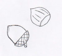
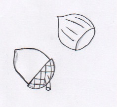
Hand-drawn sketches
So, these are some of the hand-drawn sketches that Joe and I did in the image creation process. After hand-drawing, we then scanned them in and coloured and edited in photoshop. We felt it was better to colour etc in photoshop because it would allow us to try new things with the image with unlimited attempts (rather than colouring in by hand and decided we didn't like the colour so had to start again!)


Friday, 6 January 2012
Monday, 2 January 2012
Product placement
In 2011, the ban on product placement (sometimes referred to as 'embedded marketing') was lifted. References to products and services are now permitted in shows produced in the UK. The first product to be shown after the ban was lifted was a Nescafe coffee machine on "This Morning".
The BBC still ban product placement in their programmes and by any broadcaster it is not allowed to be used in news, current affairs or children's programmes; neither is it allowed to endorse alcoholic drinks or foods high in salt, sugar and fat.
In the USA, product placement is a largely used device within films and TV programmes; with companies such as Apple or Coca-Cola paying millions of dollars to have their products shown/referenced. Comercial broadcasters and independent producers say that the ban being lifted off product placement should help pay for programmes - so surely this is a good thing for our media?
If Ofcom have the necessary restrictions and guidelines in place, then I personally see this as a positive thing as it will put money into our nation's media - and goodness knows we need it after seeing the closure of the UK Film Council and British 'small time' companies finding it ever harder to produce.
NB: product placement could NOT be featured in mine and Joe's piece as obviously it is a children's programme and we would be looking to be aired on Cbeebies which is a BBC company who do not use product placement.
 |
| Product placement 'logo' |
Some people have disagreed with the ban being lifted and believe it could damage broadcasters' credibility and promote unhealthy lifestyles. However, under 'Ofcom' regulations, broadcasters must display the 'product placement logo' before and after any programme they show containing reference to particular products or services.
In the USA, product placement is a largely used device within films and TV programmes; with companies such as Apple or Coca-Cola paying millions of dollars to have their products shown/referenced. Comercial broadcasters and independent producers say that the ban being lifted off product placement should help pay for programmes - so surely this is a good thing for our media?
If Ofcom have the necessary restrictions and guidelines in place, then I personally see this as a positive thing as it will put money into our nation's media - and goodness knows we need it after seeing the closure of the UK Film Council and British 'small time' companies finding it ever harder to produce.
NB: product placement could NOT be featured in mine and Joe's piece as obviously it is a children's programme and we would be looking to be aired on Cbeebies which is a BBC company who do not use product placement.
Subscribe to:
Posts (Atom)